Modern, yet with a hint of old-world flavour that one is reminded of through the dark wood and neutral wall palette, the simplicity of this Bengaluru home instantly appealed to me. Owned by Robin Jacob and Miriam Korula, this 1830 square feet apartment, was brought to life by interior designer Vidhya Achu Roy of White Door Designs (read more about her here) and Miriam, who provided the decor touches.
Says Miriam, “Having seen a couple of earlier projects, we knew Vidhya specialised in simple practical designs and classic silhouettes with understated elegance. We had heard a lot of stories of people undertaking home interiors and then complaining that by the end of the project the actual expenses went far beyond their initial budgets. We had a very clear idea on how much we wanted to spend and I have to say Vidhya helped us draw out a very detailed and clear plan initially itself that allowed us to stay within our budget during the execution. She was very thorough with even the minute details. Our draft to her was just to have simple and practical designs everywhere and lots of storage space. Basically a design that is really easy to maintain irrespective of having small kids.”
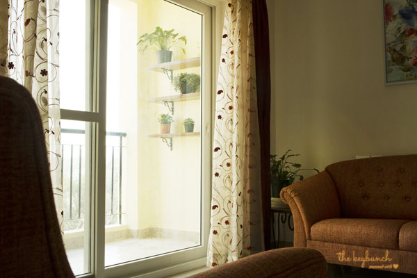
She adds, “Instead of buying new furniture, we are proud to say that all the movable furniture you see are either reupholstered, repolished or given a fresh coat of paint to make it look perfectly blended in our new home. The reason for the color scheme used in the living room is the sheer curtain fabric which was bought 5 years ago. I had gone with my cousin to finalise curtain and upholstery fabric for their home and fallen in love with this curtain fabric and bought it on a whim. It didn’t go with the décor we had in our home at the time and I assumed I had made a mistake while buying the slightly expensive sheer curtains from Drapes Avenue, Bangalore. But while we shopped for our new home, I got some perfect silk curtains and rusty orange upholstery for the sofas to match the sheer curtains and I am glad I waited.”
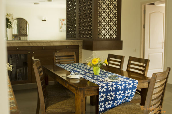
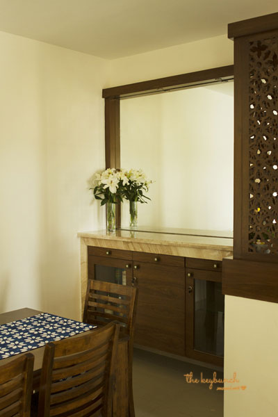
The kitchen and dining are undoubtedly the most striking feature of this home. Miriam explains, “Initially the plan was to use these kitchen titles as highlighter tiles, infrequently between a lighter shade of tiles. But the minute we saw these imported titles, it was like love at first sight and every other option we saw locally never lived up to these tiles for me and we ended up using it for the entire back splash. That is the only area of our home that I went little overboard with the costing than we had planned initially. The mirror and the marble bar counter next to the dining table as entirely Vidhya’s idea and I remember feeling unsure about it as I could not picture it in my mind. But that counter and the jalli work has been the highlight of our home. What had started as a brief to have a wash basin in the common area has turned out more aesthetically than we had ever imagined.”
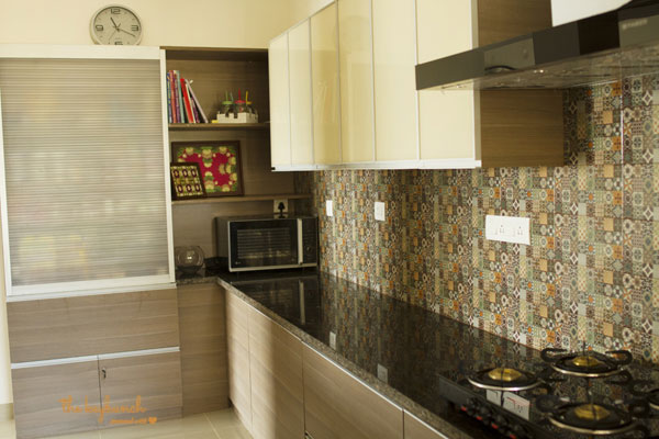
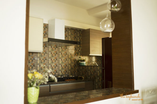
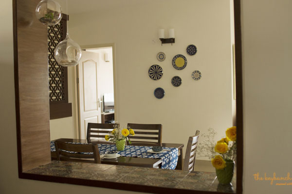
The little window opening between the dining and the kitchen is eye-catching and Miriam’s choice of a stunning back-splash was a great one, considering so much of the back-splash is visible from the dining and living areas!
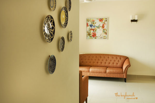
Decorative touches like charming plates on a wall, tasteful paintings and a decorative mirror in a Cathedral window shape all add a lot of visual interest to this space.
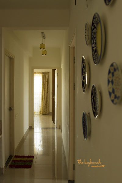
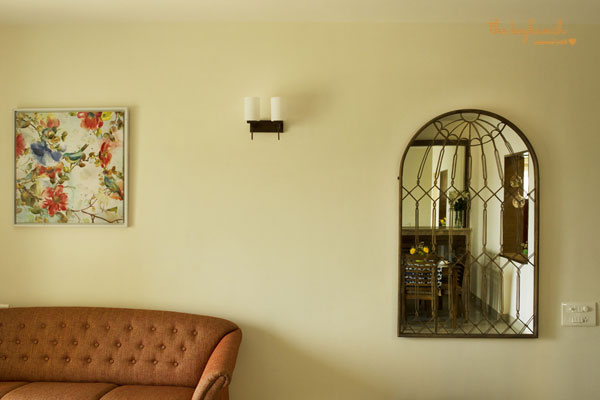
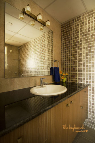
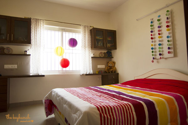
The rest of the home is also tastefully done up in neutrals and simple designs, the exception probably being the kids’ bedroom where colour concessions are generously made!
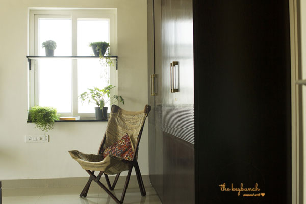
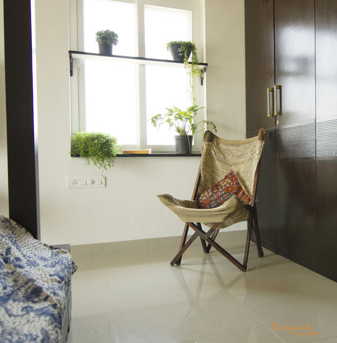
In the master bedroom, this easy chair and the textures from the fabric on the chair and the bed covers bring the room together into a warm, cohesive space. The touch of green plants on cleverly made window ledges also enhance the beauty of this space.
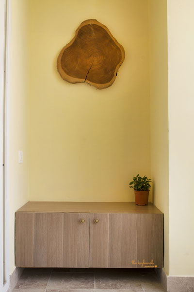
In the foyer, this little piece of wood makes a striking decor statement without going overboard.
This is a truly simple, warm and welcoming room with muted yet sophisticated decor touches. We like!
Looking for more home tours? We choose the homes we feature here very carefully, and you will find that they are a delight to tour. Click here to see more home tours on this blog.



Hello Sharon,
This home is an illustration of the concept “less is more” (sometimes though).Liked the foyer built in though i would have preferred clock hands on the abstract wood piece and kitchen back splash. Loved the jali worked corner and the marble topped bar.
Thank you Sharon for the post.
Thanks Vina, yes I agree. Less is more! Thanks for leaving a comment here, and for your kind words 🙂
loved this article
wow,very well written
Nice Article
Wow, what a great article. I really like it very much. I am also a housewife and I know very well how important is a home decoration. The tips you have mentioned in your blog are amazing, I definitely going to follow these tips in my decoration plan. Keep sharing these kinds of blog with us.
Great post. The articles which have meaningful and insightful comments are at least pleasant for me. It is interesting to read what other people thought and how it relates to them or their customers because their perspective can help you in the future. Thanks for sharing.
Very Interesting post! Thank you for such interesting resource!PS: Sorry for my bad english Thanks for weronika