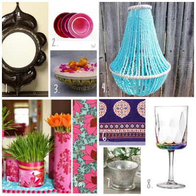
I love it when design houses use their products to create ‘looks’ or inspiration boards. Often people buy products, and then don’t really know how to put together a ‘look’ with what they buy. What a waste of a purchase!
So that’s why I want to highlight Saffron Marigold’s attempt at putting together a pictorial guide giving people a good idea about how to set off their collections with the right furniture and accessories. These are images from their recent Spring Shopping Guide. I particularly loved their Moroccan look (hugely clichéd *smiles*, yet very well put-together).
 |
| Saffron Marigold’s ‘Sultan’s Palace’ Moroccan look |
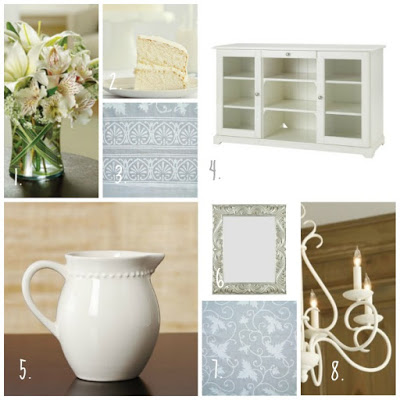
And here’s their all-white decor featuring their Ivy-lace line. Nice!
 |
| Inspiration board for Saffron Marigold’s Ivy-lace line |
I felt they could have done a better job of their Indigo and Flowers inspiration board (check out the SM blog to see it). Their Morning Dew line is one of my favorites, and they chose to feature it in a French Provencal inspiration board (see below). While their inspiration board is quite charming, I felt they could have done a better job with this one as well. May be Vasu needs to teach them a thing or two about Olioboard 😉


I sure agree……the products are very beautiful and would look better maybe with a 3d mood board:)
I puv the first nd second board,..:)
I love the first board. Great blend of colors.
I love.. the colours.. the peacock ones for sure!