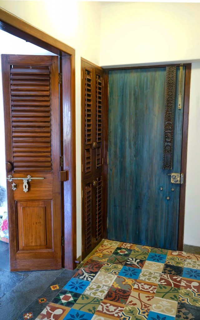
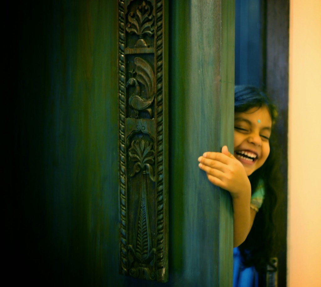
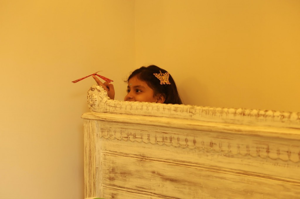
Did that pic catch your eye? It did mine – I saw that beautiful old door, with the carving on it – and I couldn’t quite place the design – was it Mexican, was it Spanish, was it Indian? “It must be Indian,” I thought, “because that little girl is wearing a bindi, and she is Indian for sure!” And that little girl – her innocence is such a lovely contrast to the seasoned look of that door!
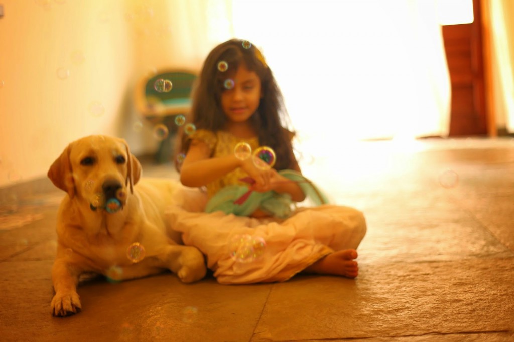
And won’t you just look at her – so sweet and adorable, totally oblivious to the camera…
It turned out that yes this was an apartment in India, yes, the little munchkin is Indian, and that door is all teak, with a little old carved piece, and deliberately made to look like it can belong to any culture that has the kind of rich background in art that India has – a world-ethnic look if you like.
The Project Brief
The Assignment was to remodel a 4 BHK apartment at Raheja Classique in Andheri West, Mumbai.
When they spoke to the design trio made up of Anu Tandon Vieira (designer), Shalini Dhawan (designer) and Jaya Peter (film maker) their brief was clear and simple
The lady of the house said, “Please do not make it look filmi, as we
come from a film background, and we do not want our home looking like a Bollywood set”.
The man of the house said, “I want a place that
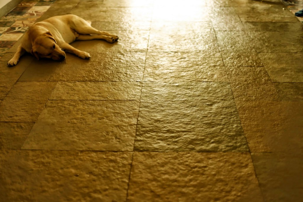
is dog-friendly. No polished floors, please. Rustic floors are more kind
to a dog’s nails”
The lady of the house said, “Give a bungalow feel to our apartment.
Earthy, arty is fine, but definitely not filmy. Give me a modern
interior with world ethnic sensibilities”
The man of the house
said, “I love to entertain in the kitchen while I cook. Cooking
destresses me, so give me a kitchen that would suit my hobby, and also my love
for good conversation with great friends while I cook”
They were to create a home where beauty meets utility, making maximum use of natural material.
 Now
Now
wasn’t that a lovely brief? The trio of designers thought so too! With the above requests, the clients gave them full freedom to unleash their creativity in this home, and that’s exactly what they did! Each of them brought key traits to this project. Please read more about them at the bottom of this post.
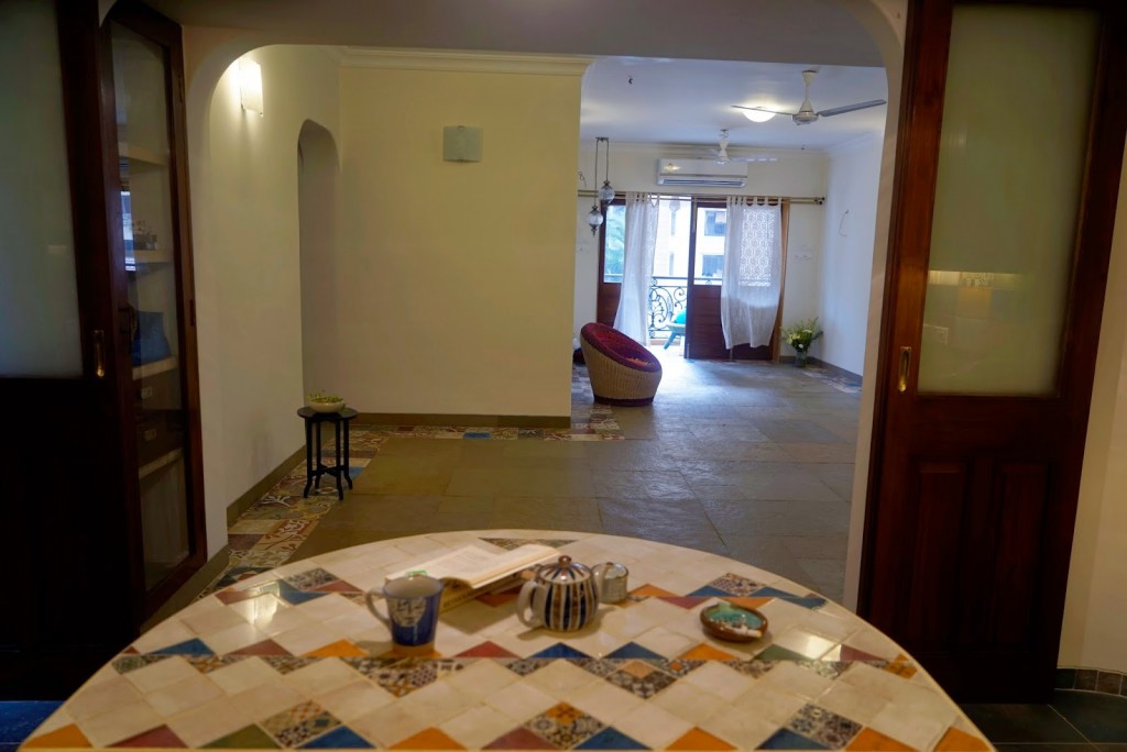
And yes, what you see in this home is an essence of various cultures without it being labelled as one or the other.. Check out the tiles in this picture for instance. They could pass off as Mexican, Portugese, even Attangudi. What are they really? Cement, handmade tiles that are put together in a beautiful patch-work welcome note at the entrance.
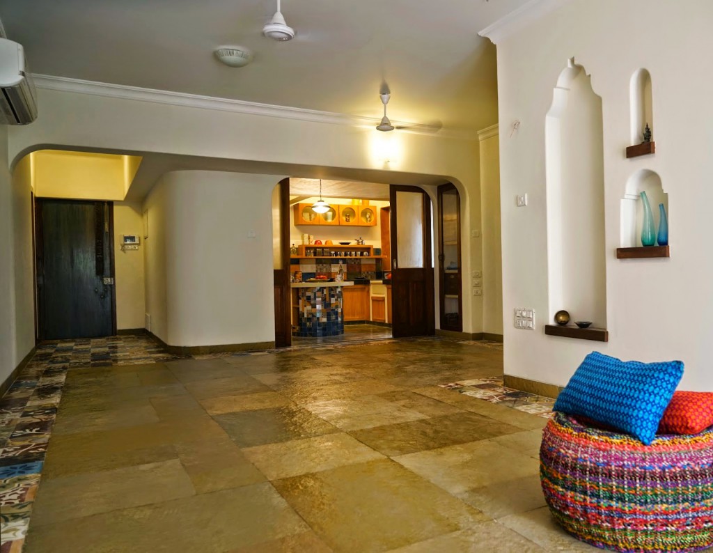
In keeping with the request for a dog-friendly floor, the designers opted for these tiles in the entryway, and a subtle border in every room. The living room has riverwashed limestone.
Says Jaya, “We started thinking creatively in September 2013. The actual work on the flat started in December 2013 and we completed the project in Sept 2014.
We started by breaking down the house to its bare shell, creating spaces that are airy and spacious, softening the edges of the walls and changing its contours to sweeping sensuous curves, aesthetic niches flowing from the interior of the house to the exterior, and designing an eclectic floor space that is animal friendly (using a mix of tiles and natural stone.)”
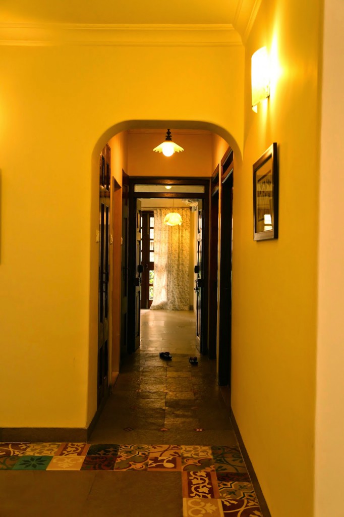 |
| The eye catching tile border around the limestone looks beautiful! |
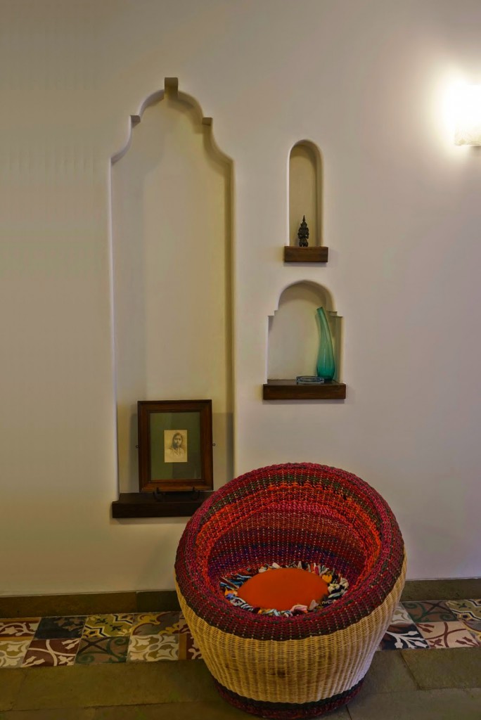 According to the Anu Tandon Viera, with whom I had a long talk about this home, “The whole home has elements that have a kind of permanence – it was made to last. Not with the idea that it could always be broken down tomorrow to make way for a new design!”
I thought that was lovely, especially as that’s exactly how a home should be, in my view. I like the fact that a home can tell stories about the people who have lived and loved in it!
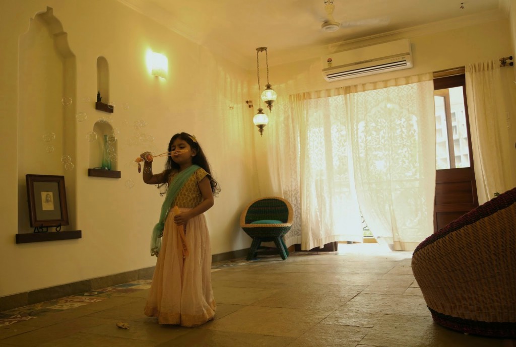
All the 3 designers strongly conformed to this belief of building a home that would last, and careful thought went into designing and installing every aspect of the home. The idea of permanence overtook all other aspects. This home has no straight corners – they are all carefully rounded. The arches in the living area are reminiscent of the arches in some cultures, but they are not in any typical style.
The niches and built-in shelving (see living room pic above) were also carefully thought out, and are in line with the “permanence” that is such a strong feature of this home’s design.
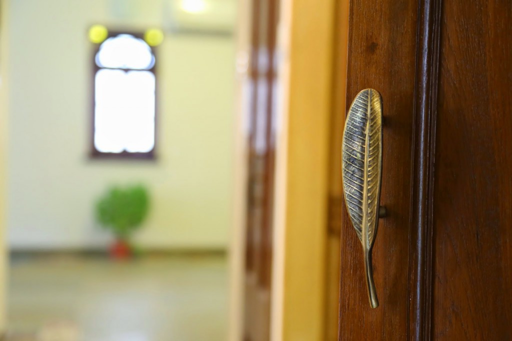
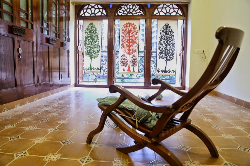
All the doors are made of teak wood. The old carved panels were bought, particular attention was paid to sourcing panels that looked ethnic, but could pass off as ones from any culture. Says Jaya, “We were able to acquire some antique wooden doors, windows,that were restored to add that unique old world charm that the client wanted.”
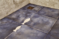
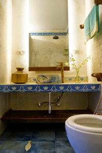
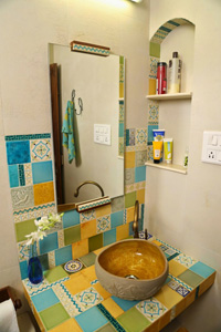
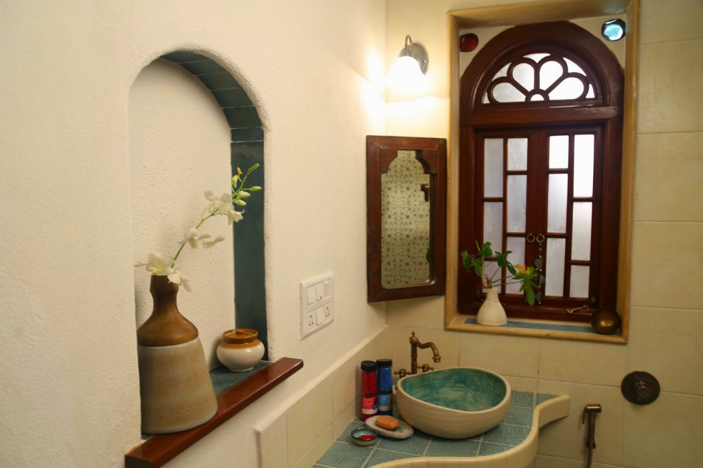
I particularly loved the design in the bathrooms. See for yourself
 |
 |
 |
 |
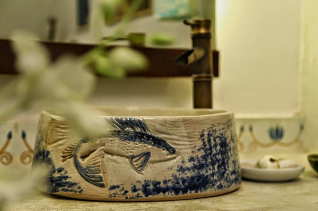
The designers say, “The bathrooms were fitted with specially designed antique faucets, showers etc, with each washbasin custom made according to a theme.. e.g., the guest bathroom followed an aqua theme with a fish wash basin, indigo tiles with fish insets…”
 |
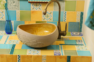 |
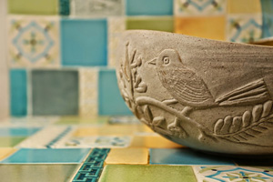
The beautiful ceramic designs in the bathroom were customized. The design team worked out the motifs they wanted to incorporate, designed the look and shared the colorbar with the ceramists who were given complete creative freedom when making the actual pieces.
Didn’t you love all that ceramic work? The brass taps and fittings were all imported because we do not get these brass beauties in India anymore!
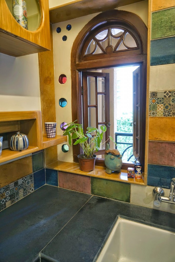
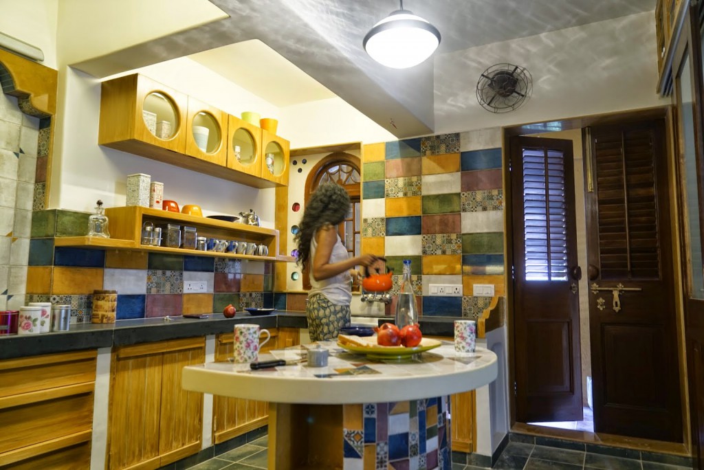
The kitchen – I love the tiles and the gorgeous window vignette that the trio shared with me.
A lot of thought went into the kitchen – it is functional and completely modern, but the look is world ethnic. The mosaic on the island was pieced together from little bits of the same tiles.
 |
| This is my fav click of the kitchen! |
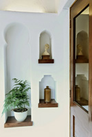
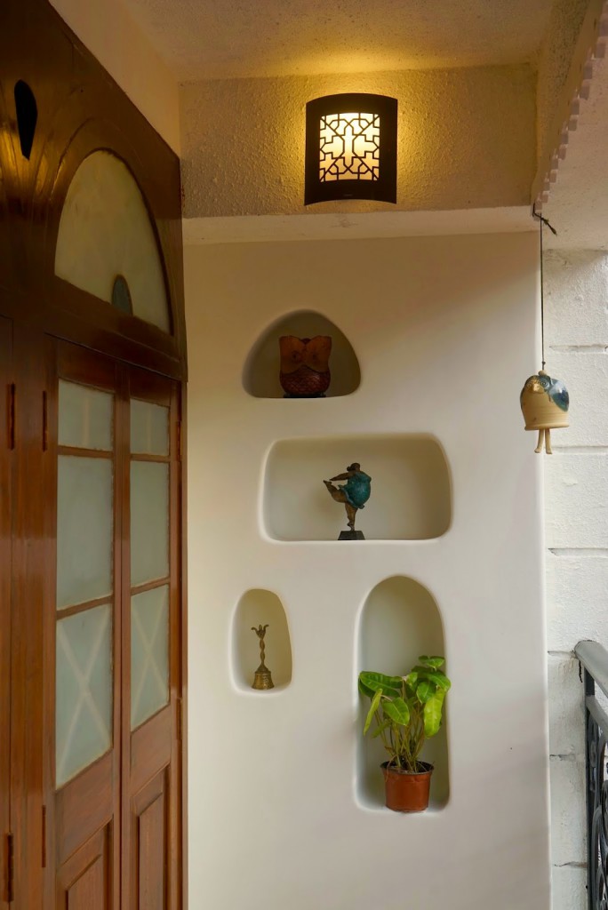
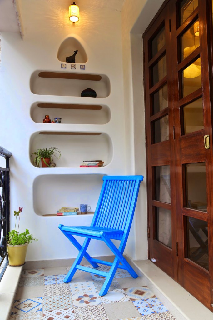
The balconies are beautiful little spaces that have the same handmade tiles and little nooks in the wall.
 |
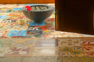 |
The patterned tiles which skirt the living room floor come together in a gorgeous patchwork quilt design on the balcony floor.
Another balcony (pics below) has a more sober version of these tiles on the floor.
 |
 |
About the designers
Anu Tandon Vieira is the founder of The Retyrement Plan, an initiative that uses discarded tyres, textile waste, twine, bamboo and cane to create furniture. Anu has worked on a wide array of projects ranging from restoration and refurbishing palaces in Udaipur to art direction for feature films to creating textiles for the international market. She has a background in sculpting. Anu has also been featured on this blog here.
Shalini Dhawan and Jaya Peter started livin art: functional art installations that balance form and function, craft and design. Their home furniture is made in organic shapes, fashioned from reclaimed wood and vividly painted/printed. Check out their projects on FB here.
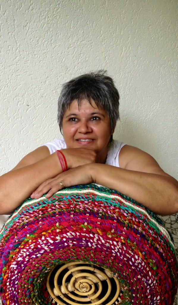 |
| Anu Tandon Viera |
 Each of them brought distinct strengths to this project. Anu played a key role in keeping everything functional, well-designed and made sure the spaces were used optimally. For example, this louvred door right next to the front door actually led to the study. Anu wanted to remove the awkwardness and pointlessness of two doors right next to each other.
She conceptualized a large store area that took in a part of the study room, and made a mirror storage area on the other side of the study, to make the maximum use of this space.
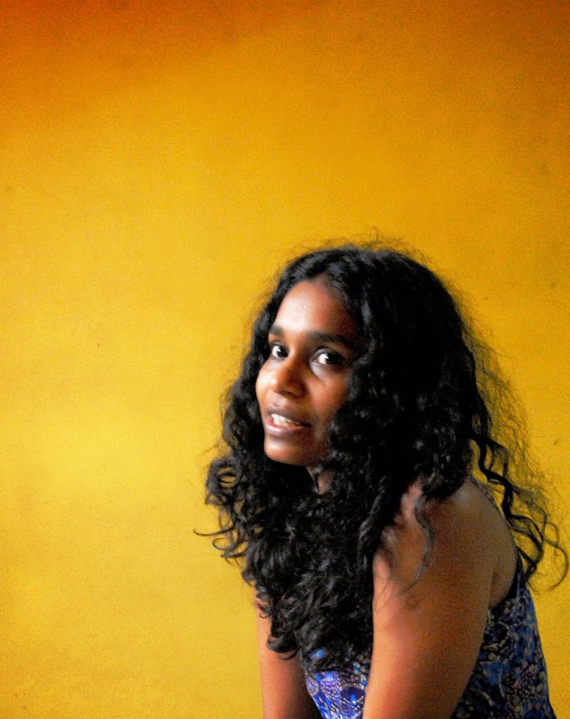 |
| Jaya Peter |
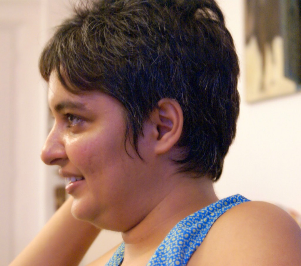 |
| Shalini Dhawan |
Shalini on the other hand excels in detailing. She is an NID graduate. Her attention to detail is probably why this project has gone from great to wow! For instance, her detailing skills were responsible for the fabulous outcome of the kitchen – she orchestrated the exact placement of each piece of mosaic so that it came together the way it has!
Jaya who is a film director contributed valuable insights with her visualization and her tendency of being able to see the whole picture.
The talented ladies have done a marvelous job with the interiors, but all of them say that it was all due to the fact that the client was a “dream client”. Says Anu, “There was a complete sync in sensibilities yet complete freedom in terms of design. They never tried to force their ideas on them. The trust was fantastic, and that made the difference!”
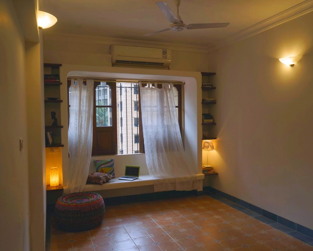
I leave you with some final images of the home, so that you take back the warmth and the beauty of this space, when you leave this page.
Photos: Amber Wasi and Soumitro Ghosh.





Awesome post, loved every detail of this home.
Thanks so much Rekha!
Beautiful home. Love the floor tiles as well as the wall ones, the alcoves and the lovely window seat and wait, love all that open space too. Feel like moving in right now
I agree Reshma, this is so clean, minimalist and the floors are so beautiful!
The home is beyond gorgeous.. wow!! everything from the tiles to the rest of the following, the window seat, the curtains, the blue chair, the grooves on the wall… the doors.. WOW.. I could just move into the bathroom.. let alone the rest of the house..
Pats, the bathroom – the ceramics…I guess I would have to wait for the kids to grow up a bit before I dare to use such beautiful ceramics in the bathroom!
Ohh my Sharon , this is one super gorgeous home. Thank you for sharing. Love tiles, kitchen, bath and it's all in the details. I love all niche created in walls.window in the kitchen, window seat, balcony ohh I can go on and on.
Nayana… so many of us are reacting like this~! this is one original decor project, ain't it?!
wow…total non-conformist look that is!!
especially in a place like Mumbai where space is a premium, to create this sort of illusion of space and not make it look like every/any other home is amazing!!!!
b.e.a.u.t.i.f.u.l.!!!
Brinda, how right you are! Mumbai and this spacious, bungalow kind of look!
Beautiful home ! Just loved the old world charm it has !
Karishma, you are so right – that charm is missing in so many homes these days!
Utterly beautiful home – rustic, elegant and so much character. loved reading this post Sharon
Nandita, thank you, so good to see you here!
Such a beautiful home
I loved the tiles they have used. It looks so earthen…
Vasudha, me too. So few of us take the trouble to opt for handmade tiles, when it is actually good for us!
Wow…..I love the floor….so dog friendly…. actually….excellent home….thoughts from the heart put into making this home beautiful….. love it….awesome…..!
Pingback: 3 Tips if you are thinking of a Home Renovation Project | The Keybunch Decor Blog
Pingback: 3 Tips if you are thinking of a Home Renovation Project - Abhay Interiors