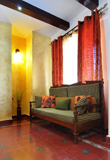
Happy New Year to all of you! I apologize for being away for so long, but the last days of 2013 were pretty hectic, and I had to give myself some screen detox, and lots of R&R! 
Browsing through interior designer Jyotika Baleri’s work on her Facebook business page, Destination Designs, I was delighted to see the warmth of Chettinad reaching out to me. When I clicked on the pics, I had to have them on this blog. Jyotika was happy to contact the home owner Mrs Komala Krishna, and get her permission for a feature on this blog!
I know many of my readers are looking to use all the antiques they have inherited from their parents and grandparents, but are quite challenged on how to do so! I think these pictures will give you a fair idea on how to bring the goodness of the old homes, and blend in modern day conveniences!
When Jyotika was approached by the owner Mrs. Komala Krishna, she was told that a 2000 square feet 3-bedroom apartment in Bangalore was converted into 2 units, a 2 bedroom 1400 sft home and a 600 sft studio that was to be let. The brief was clear – Mrs. Krishna wanted her to work on the 2 bedroom section, and she was to keep it ethnic in its looks, yet modern in its functionality.
Says Jyotika, “Converting the 1400 sft space was a challenge in itself since all it had was a large hall cum dining, a large balcony and 2 bedrooms with attached bath. The obvious option was an open kitchen in the dining area. But it had to look clean and elegant. So many brain storming sessions and a million drawings later came the perfect layout”.
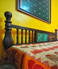 |
| Solid teak beds work with the typical style of the house. The tile motifs have been extended to the headrest too. |
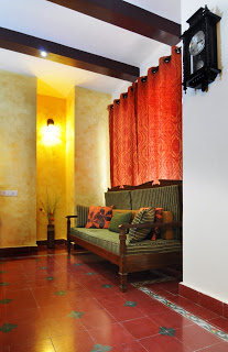
Like what you see? Here are some takeaways from this home tour!
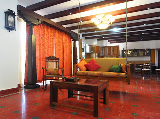
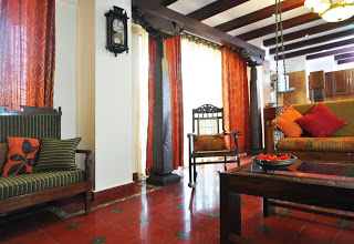
- Traditional Aatangudi custom flooring was chosen to get the trademark appearance of old chettinad bungalows. Aatangudi tiles are economical and especially recommended for Indian weather. To learn more, do read this article on Prissma! However, be careful when you choose your supplier. The comments section of the Prissma article will tell you about others’ experiences with ordering these tiles for their homes.On a personal note, I have this dream of owning my own home, solely for the pleasure of doing up the floors with this beautiful heritage material!:)
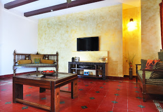
- Use and re-use your old furniture. Even in a modern setting, antiques are charming, and give you that accent feature for your homes!
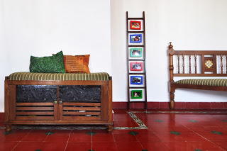
- Don’t hesitate to blend the old with the new – in the image below, the colorful ladder adds quite some charm to a room predominantly laid out with old-world furniture. Also, the kitchen is modern, yet blends in with the Chettinad look – the wood color has a lot to do with this, so take note!
- To add instant old-world regality to your home, antique-looking rafters on the ceiling are unbeatable! Talk to your carpenter about installing these, but remember, for the right effect, you will need to get the furniture, decor and flooring right too!
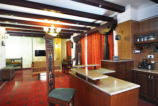 |
| High back wrought iron chairs form lovely breakfast chairs to the open kitchen counter which sits in the middle of the hall and dining areas, adding drama to the otherwise linear room. |
I thoroughly enjoyed putting this home tour together, and I am so glad it is also my first post in 2014. Do you live in a home like this, that blends the antique with the modern? I would love to hear from you, or see pics for a possible feature on this blog.
I thank Mrs. Komala Krishna, and the architect Jyotika Baleri for their co-operation in featuring this home on The Keybunch! If you liked this home tour, or have something to say about it, do tell us in the comments section! We love to hear from our readers!
All pictures are courtesy Jyotika Baleri. Please do not use them without her permission.



So beautiful…the ochre & terracotta adds to the warmth.
This is a apartment !!! simply beautiful
Beautiful home and space!
As you said it, perfect blend of antique and modern. Loved the colours and the generous use of wood and the lighting. That too an apartment! Great work
wht?? its an apartment??gosh…looks like a sprawling bungalow!!beautiful!!
Beautiful blend of the old in a new ambiance. Kudos to the owners & the designer! Inspirational!
it lokks much bigger than 1400sq feet. Love the corner seating they have near the TV.
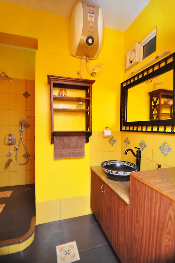
absolutely gorgeous, It does look like bungalow! I simply adore the wash room!
Wow, amazing living space! Loved several elements of the home especially the Athangudi tiles, the ladder photo frame and the bar stool. Thanks for the tour KeyBunch!
the key point in this post is….space and beauty of this home design….
Thanks everyone, especially those who have been voting for us!
this is great one, home designs ideas are always hug me for huge…
Amazed at the use of such rich colours.Its a very Indian decor which is exceptional due to its neatness and spacious feel.Thank you Neha for featuring this home.