 When designer Jaya Peter of Livinart wrote in to me with photographs of their latest low budget project, I was intrigued. To add to the thrill, the owner of this loft house in Madh Island is fantasy writer Samit Basu (author of The Simoqin Prophecies, The Manticore’s Secret and The Unwaba Revelations, the three parts of The GameWorld Trilogy, a fantasy trilogy published by Penguin Books, India). As an aspiring writer, and as an appreciator of art and aesthetics in modern design, this is probably the dream home for me to feature!
 A bit of background about Livinart – they are a trio of creative people – Anu, Shalini and Jaya, with complementary strengths. Last year I featured another gorgeous home done by them. They believe in usable, need-based design, and want to make memorable pieces of furniture that become special to people who own it! In this project, everything including the lamps, curtains etc have been custom made for the client.
Says Jaya, “The first thing that stuck us about the space was the sense of scale, it is a loft house and the height of the ceiling is around 20 feet, looking out into the Arabian sea 260 degrees….stunning blue sea…”. Mental notes were made immediately about an aqua theme reflecting indoors as well. hence the blue curtains and the sea green kitchen and TV unit.
It is a bachelor pad and Samit being a graphic novelist wanted them to see the space from that perspective.
The bedroom
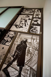
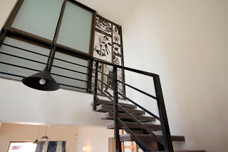 The flight of stairs that leads into his room has a sliding door which they wanted to treat like a page out of a graphic novel. After quizzing him on his favorite characters, they made a storyboard with an interesting array of characters. The fact that the railing and stairs were black, white and grey helped in creating an interesting graphic frame.
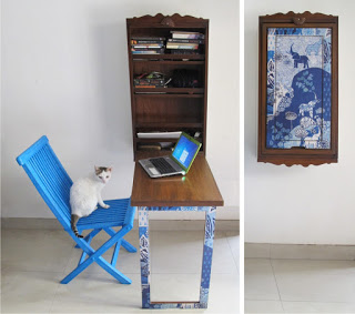
 His writing desk needed to look into the sea, but the space in his room
upstairs was barely enough for a bed, hence they decided to give him their classic space saver computer table (featured in the cover pic above) that would perfectly in his space.
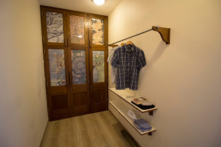
They also wanted to treat the doors of his wardrobe not merely as wooden shutters but a framed art work. They ran the idea of using ancient maps by him. After brainstorming, they decided to use maps out of his favorite fantasy fiction/comics e.g: Asterix map of Gaul), Terry Pratchets Discworld map, Lord of the Rings etc..
On choosing the lighting
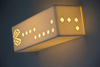
Samit likes gaming and is a fan of pacman. hence the team decided to surprise him by making Pacman lights for his house.
The rest of the accent lights, were custom-made in various shapes and sizes because it was near impossible to pick up lights from any store since the sense of scale in this loft house demanded really big lights or a cluster of 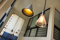 different lights in sizes and shapes. After some trial and error, they hit upon the correct cluster of black and grey lights that were conical, helmet shaped etc..
Says Jaya, “Now hanging the lights and fans were a production in itself as we needed to make long rods (like in high ceiling churches) to hang the fans and lights at a decent height.”
The soft furnishings
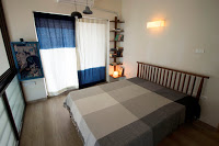
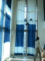 The curtains had to be a blue ombre, in keeping with the sea-views. 19 feet cutains cannot be bought in shops but had to be made to scale so that the point where the white moves into light blue which moves into indigo is at the correct place.
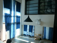 Shalini custom-made a print in which fish move from one side of the ombre to another in the central panel. Anu had worked with some artisans from Rajasthan who would be able to achieve all this.
Hence the 20 feet long curtains got made. This is a classic example of the synergy this design team possesses!
Custom-made furniture
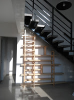
Most of the furniture was custom-made or sourced from Liviart’s own design studio. The trio spent a lot of time in the flat at different times of the day to truly understand the play of light, and the feel of the space.
Says Jaya, “We needed to give him a nice big book shelf. The ideal space was below the staircase. While spending time in the flat we noticed that in the afternoon, the sunlight created nice shafts through the staircase on the wall. We decided to follow these lines and make a book shelf along that wall.”
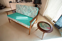
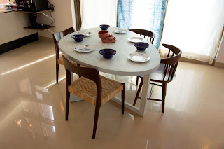
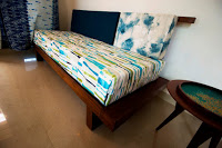 Most of the furniture has a zen quality to it. The egg shaped dining table with its eclectic mix of chairs, the pull out japo day bed (featured here in both its avatars), the sofas with a hint of an upward curve etc.
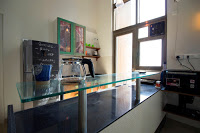 The side tables have a detachable tray which can be carried to any part of the room. Here they conceded to a splash of color and print. The kitchen is a functional yet well-designed space with clean lines and masculine colors.
So keeping the space masculine, with splashes of indigo, green, they maintained the theme of a writer in residence by the sea.
Images via Livinart. Click on images for a better view




Nice house, Nice Decoration, Nice Post!!!!
Hey Madhumita, thank you! Sooo good seeing you here…
I love the wall mounted foldable study. any idea where its from
livinart
very nice
Nilkamal Mattress
Nice post. Thank you for sharing this article.