Bangalore-based White Door Designs is a unique interior design practice. It caught my eye, because founder Vidhya Achu Roy has a holistic approach to her work, and draws inspiration from diverse sources. She may look around and get drawn or moved by the everyday mundane, or she may look at a bigger picture, the universal eco-system, and bring it to life for a client’s home; she loves to make a sustainable and meaningful difference through her projects.
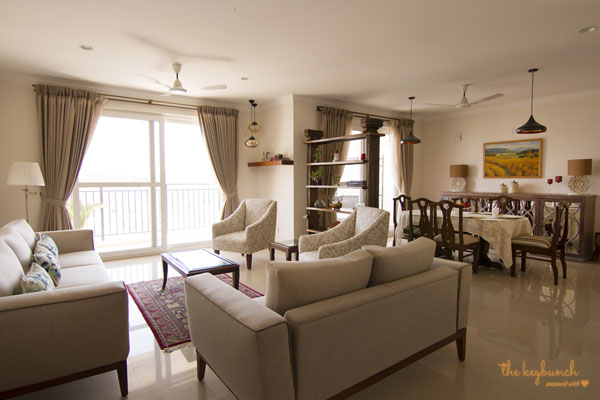
Each piece has been carefully hand-picked and thoughtfully put together to create this picture-perfect home. The fabric looks white, but it is actually highly durable, off-white, textured, with a greyish tinge, amenable to daily wear and tear, and therefore practical!
I may have gone overboard with my introduction about Vidhya, but when I think again, I tell myself, no! Her designs are truly thoughtful and she takes a keen interest in giving her best, putting everything she has into a client’s home, holding nothing back. I got a keen sense of her commitment both while I spoke to her, and also called up a client of hers to talk about her work and what they felt about it.

(L) A perfect corner to share a cuppa with friends on lazy afternoons. But there’s more. This corner was inspired by the painting above it. The painting is by Bengaluru artist Ganapati Hegde known for his flora and fauna paintings with a hint of whimsy. This painting titled The Lazy Frog depicts a frog lazing with a cuppa in Ganpati’s signature style, with a swarm of flies sitting on it. It’s the height of sloth, and Vidhya thought that a seat to lounge on doing nothing, would make the perfect addition to this corner.
(R) Work is Play, when it’s a nook like this in your bedroom, filled with your favourite things
The projects from White Door are not an over the top exercise in minimalism, and certainly not clinical and impersonal (as is the case with most designers that want to push innovative designs without the accompanying warmth that a home always needs). The underlying theme in all of this firm’s work is a fine balance between designs that are not over the top but have just the right amount of personalisation to make them look like a home!
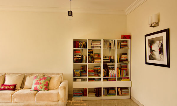
The owners of this home are book lovers, and books became the hero of this section. The bookshelf was kept simple, and it took on a personality of its own, when the books filled it. The colour on the painting and cushion cover bring this room together.
White Door Design clients are usually treated to more than what they paid for. A story I loved hearing about this studio is about a client who was not convinced about a piece (in their mind it didn’t quite fit in – as it was a traditional piece in a modern décor setting). Vidhya however, was absolutely sure that it would be the conversation piece of this home, and when she insisted, the client gave in and bought it. It was kept in storage until the home got ready, and throughout this time, the client was in doubt, wondering if they would regret having listened to Vidhya. Vidhya was sure, but wanted the homeowners to see for themselves how it would look within the setting. She was willing to give in if they didn’t like it after the home was decorated. Finally, when the home was done up, it looked spectacular with the accent piece! The clients say they are delighted that this piece is the focus whenever someone walks into the home.
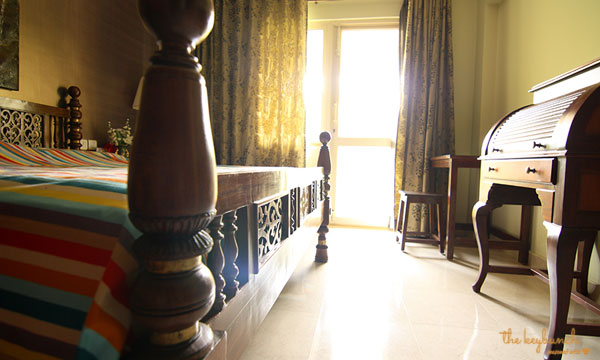
Traditional fret-work teak wood king-sized bed with a roll-top study table. The entire home has a traditional look to it.The owners were particular about using solid wood throughout the home, and these pieces were consciously sourced to match the requirement.
Vidhya’s Adarsh Palm Retreat project is a lovely execution of her trademark minimalist look with a very personal touch. Choice pieces of furniture and elegant upholstery complement the interiors. Standalone pieces like a bookshelf, a console table and an accent 3-seater are a welcome change as I observe with a sigh of relief that the interiors are free from the usual ply woodwork that one sees in professionally designed homes. Says Vidhya, “We work towards turning even the most whimsical ideas into solutions; our design ethos lies in a fierce sense of commitment, attention to detail and a signature benchmark in quality.” And this resonates with her clients too.
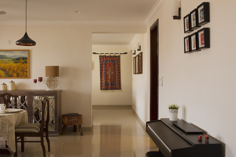
Spaces flow and blend together seamlessly by a clever integration of colours and accessories.
“Vidhya has designed a beautiful home for us and we had a great time working with her. She has a wonderful sense of design and a knack of understanding what a client wants. She understood my need to blend the classic with a twist of the modern and came up with some great stuff. She has an excellent taste in interiors and is extremely diligent, responsible and fair in her engagements. If you want to build a home which reflects your own individuality – she brings that to life!” says Sonam Lal who owns the Adarsh Palm Retreat apartment featured here.
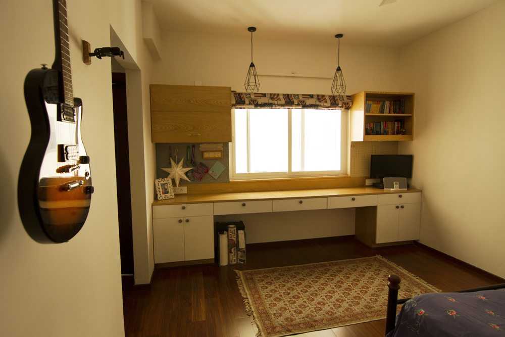
This is a teenager’s room, but it reflects her interests. She is into DIY’s, loves music, and didn’t want anything typically girly. This is a room that has a place for everything she owns, and is functional yet beautiful. Little touches of colour come from the bedspread, and a fabric noticeboard on a wall (not seen in this pic). Textures and material add interest to this room.
With Vidhya, the personal touch is never overlooked. When a home is ready, it’s not just finished, it is complete. Almost as if the home owner has personalized it. This, if you ask me, should always be the defining factor after you check an interior designer’s quality of material used, and work ethics.
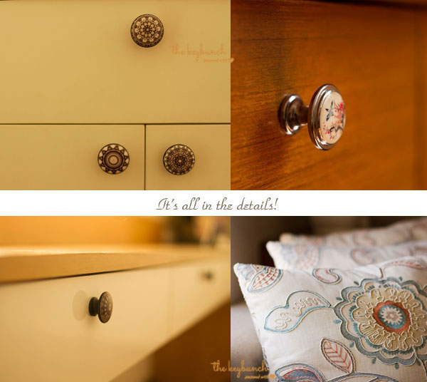
“God is in the details… even when they are as small as a mandala-inspired knob,” says Vidhya. And these are images of her passion to get the details right in every project. The knob on top right with a bird image on it belongs to a room which has bird motifs on the curtain and cushion covers. Small and subtle, yet enough to make a difference – it’s the attention to detail that makes a project stand out!
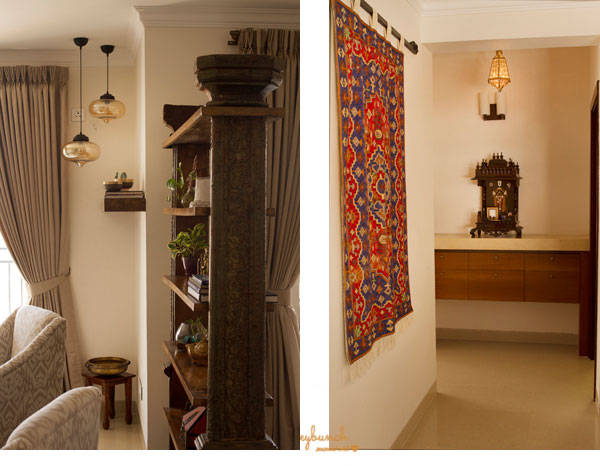
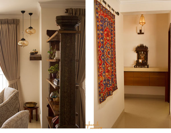
(L) A divider which also serves as a display unit, is in complete contrast to the rest of the home. Yet, it doesn’t look out of place. Built with original, untouched temple pillars, it has everything an accent piece should have – a deep history and meaning, and something that stands out, but enhances the space it is placed in. The owners were keen on having a bit of greenery, but didn’t want anything high maintenance such as large planters. This shelf also accommodated this need by giving the home owners a space for little plants and succulents.
(R) The simplicity of this unconventional puja unit with clean lines and a marble top, is heightened with a bit of drama in the light fixtures and a wall kilim.
“One last question,” I say to Vidhya as I take leave. “What’s the reasoning behind the name?” Explains Vidhya, “The name really is the answer to the ‘Why’ question. I believe that homes truly signify a fresh start, a brand new beginning. And white is a colour for newness and optimism.
Brides wear white, babies are baptised in white. All beginnings are represented by white. A door also is a very powerful symbol that I identify with. An open door is an invitation to endless possibilities. The combination of the two really struck a cord and made a powerful connection for me.” “Wow! That’s a lovely name story”, I think. As I leave, Vidhya throws this at me, “Did you know that even though White is not really a colour, it comprises of all the colours in the spectrum? That dichotomy really says it all. You can make your home (life) anything you want it to be. Colour it your way!”

Contact Vidhya at White Door Designs
Address: No.906, 1st Floor, Raj Arcade, 5th A Cross, 1st Block, Kalyan Nagar, HRBR Layout, Bangalore-560043
Website: www.whitedoordesigns.com
E-mail id: vidhya@whitedoordesigns.com
Mobile no: +91-9901997156



I really love this blog, DIY, shelves, furniture was beautiful and looking cool.
Deisgn were really good and i really liked it.
Pingback: Home Tour: Style & Simplicity at the Jacobs’ beautiful Bengaluru Apartment | The Keybunch Decor Blog