
Last week the design community in India was treated to a lovely new online design mag Prismma. It is spear-headed by Rekha Nambiar, a well-known face in the world of Indian decor blogs. Here’s an honest review 🙂
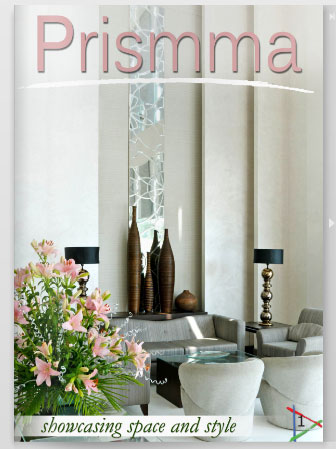 |
| The cover page |
A wonderfully put-together e-zine – As soon as I got my hands on Prismma, I abandoned all my other work and spent the next hour and a half flipping through its 240-odd pages of gorgeous pics, great content and delightfully styled interiors, artists, profiles and paintings…whew! for a new mag, this was one big-bang start! I was amazed that each issue has so many pages of great ideas, features and stories – this is a great concept!
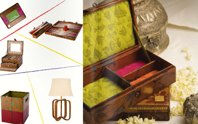
A wee disappointed with – the fact that the copy lacked polish in several places – noticeable typos, text color that didn’t stand out, and the choice of font size and styles. Perhaps it’s something others wouldn’t mind, but because I am picky about language and text (blame it on my work as a writer/editor), it stood out like a sore thumb for me 🙁
Also, since it’s an online mag, I would have loved to have a better navigation feature, perhaps a clickable Table of Contents on the left side to help me navigate through the pages better!
My first thoughts on Prismma – “Wow! This is such a cool idea, a niche segment – and they are doing almost everything right – way to go!!”
What I loved about it – The carefully chosen stories – a great mix of content ranging from home tours, to design bloggers’ styling ideas, artist and designer features, new products, travel, food, entertainment and art – who wouldn’t love this mag?
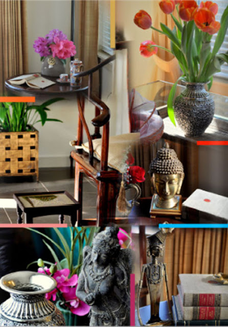 |
| Blogger Anuradha Varma’s feature on Prismma |
I enjoyed reading about Bobby Aggarwal’s serendipitous discovery of leather at Dharavi after which there was no looking back for him! I also enjoyed the Blogger Style Speak series, especially Anuradha’s page. I have seen Anu’s home in several features, but she still managed to share some unique pictures (see collage above) and a very interesting writeup 🙂
Kaveri Singh’s fascinating work in “Brushstrokes of creativity’, Sasi Menon’s work, the story on Saundi Mitti and Sonia Sareen’s breathtaking glass designs, especially her cold ceramic work’ (pic below) were excellent features.
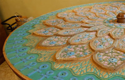 |
| Sonia Sareen’s glass wonde on Prismma |
I love home tours, and when we pioneered the concept of home tours here on The Keybunch, they were well received. You can never go wrong with a home tour because it peeks into the personal spaces of people. Being design lovers, the (lurking) voyeuristic streak that we sometimes can’t help but give in to 🙂 makes us lap up these personal pictures with glee! The home tours on Prismma are no less exciting. The Middya residence and the home-stay in Kerala were well- presented personal pieces and I thoroughly enjoyed them!
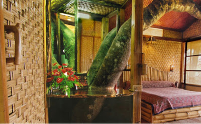 |
| Tranquil resort in Kerala, tree house |
My favorite feature(s) in this first issue – The features on Kaveri Singh, Sonia Sareen and the Middya residence.
My favorite pic on Prismma – It’s difficult to choose just one, but if I had to choose – it would be this one of the Middya residence.
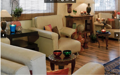 |
| Home tour of the Middya residence |
If I were to suggest one new feature to Prismma, guess what it would be? I think the synergistic team especially with the lovely styling skills of Purva Kaushal and excellent photographic skills of Ravi Dhingra can do so much more! I mean just look at what they have brought out – and this must be just a glimpse of their unleashed potential!! Check them out here…
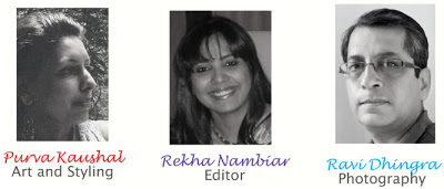
So guys, what I would really love to see in the forthcoming issues is more styling ideas from your team!
The Keybunch Verdict: (4/5)
To see Prismma mag’s first issue visit their website – http://www.prismmamagazine.com/
All images from Prismma magazine.



Thanks! Loved the design your wardrobe section. 🙂 Overall good pointers for effective use of space too.
🙂
Great recap. Thanks for sharing…must go check it out!
Lovely review!! very well written!! I did a review post on my blog too of the same magazine:)
Thank you. Very nice e-zine, I really enjoyed it:) Loved your thoughtful review so much.
Great review Sharon!!! Just flipped thru' hurriedly and seems like it can hold the attention. One thing I noticed was it was not easy to scroll on the page and the navigation was difficult 🙂
Such a wonderful, comprehensive review. I think it's wonderful to see a "desi" design mag online, there definitely was a void in that space! Hadn't heard of the blogger team prior to this, it might help to have a link to the blog in your post?
Lovely magazine!
PS: Typos and botched grammar are what turn me off each time–I can so relate to you here, Sharon!
Wow, I just saw this! Great review and a very good post. Thanks for the special mention 🙂 I am really touched!
A really well written review. I am always impressed by your balanced take on everything. Keep up the good work!
Thank you.. Im here after a long break.. Loved all the new stuff 🙂
What an honest review. Really well written Sharon…
nice to see an honest and well written review rather than the usual ohhs and aahs we see in the blogging cirlces
cool job Sharon
cool review!
Thank you for the review,Sharon. The feedback was most helpful.Have posted it on Prismma
http://www.prismma.in/news/162/prismma-review-by-the-keybunch/
Beautiful!!! Absolutely brilliant color combinations. Really love these. And ha.. please do checkout some of my handmade cards at http://www.eigth.in